
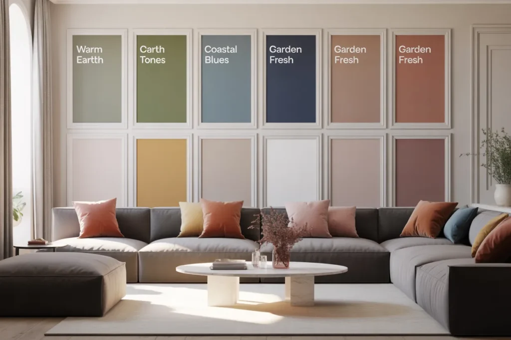
The living room color palettes of 2026 are shifting in a way that feels both refreshing and deeply familiar. Designers are moving away from cold grays and leaning into warm, grounded tones inspired by nature, comfort, and timeless elegance. Sherwin-Williams and Benjamin Moore are leading this transition with shades that feel softer, richer, and more livable.
What makes 2026 palettes stand out is their ability to balance warmth with depth. From earthy khakis to moody charcoals and creamy neutrals, these colors create spaces that feel curated rather than trendy. If you want a living room that feels modern yet timeless, these palettes are exactly where to start.
1. Warm Earthy Neutral — Universal Khaki Living Room
Contents
- 1 1. Warm Earthy Neutral — Universal Khaki Living Room
- 2 2. Moody Elegance — Silhouette Accent Palette
- 3 3. Creamy White Comfort — Swiss Coffee Living Room
- 4 4. Nature-Inspired Green — Soft Sage & Organic Layers
- 5 5. Greige Revival — Warm Gray-Beige Blend
- 6 6. Deep Green Drama — Black Forest Green Living Room
- 7 7. Soft Blue-Gray Calm — Smoke & Muted Blues
- 8 Final Thoughts
Universal Khaki SW 6150 is defining the tone of 2026 with its soft mix of beige and olive undertones. It creates a calm, grounded backdrop that adapts beautifully to both bright and low-light living rooms. This shade feels warmer than traditional beige, making it perfect for cozy yet modern interiors.
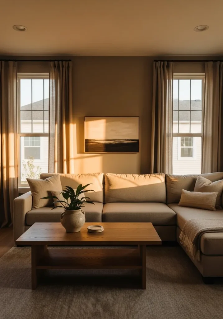
Pair this color with textured fabrics, light oak furniture, and soft linen curtains to build depth without clutter. Add layered lighting and subtle metallic accents to elevate the palette while keeping the overall vibe relaxed and inviting.
🎨 Love exploring 2026 color trends? See how this year’s breakout kitchen color — butter yellow — brings the same warm, cheerful energy into 12 real kitchen spaces that look incredibly fresh and timeless:
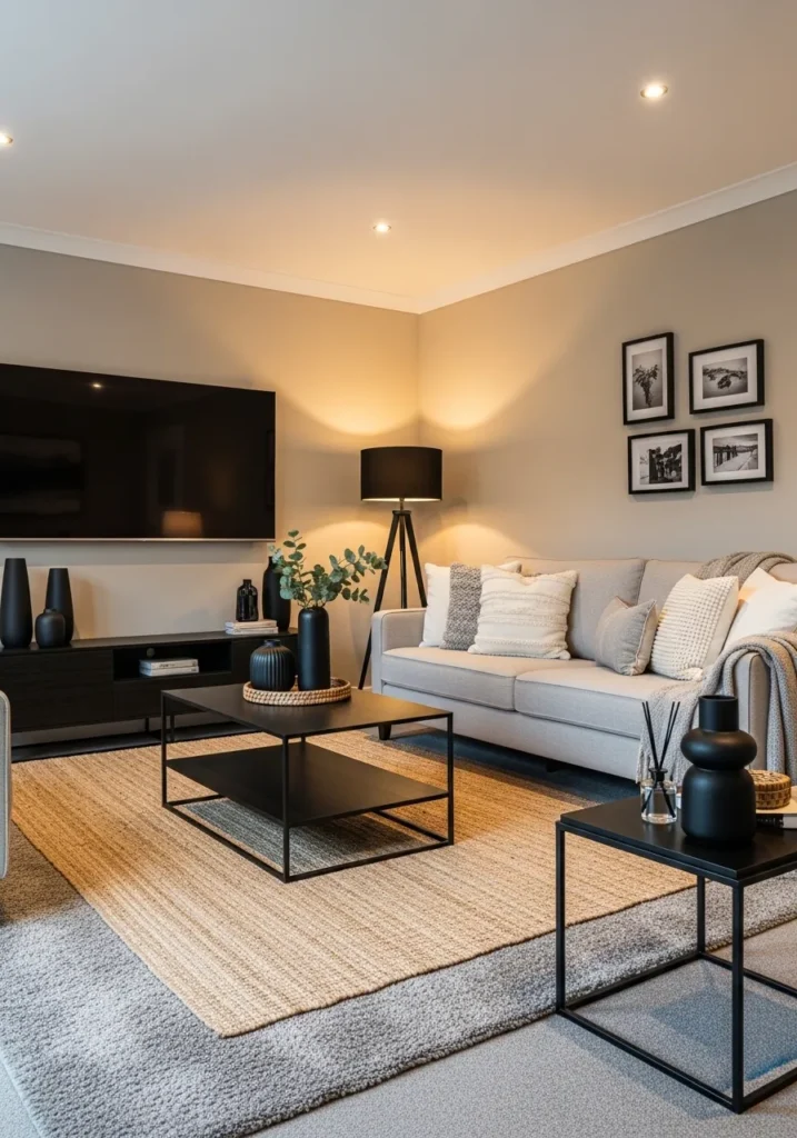
2. Moody Elegance — Silhouette Accent Palette
Silhouette AF-655 brings a dramatic yet refined presence with its deep espresso and charcoal undertones. It works beautifully as an accent wall or full-room color when you want a cocoon-like, intimate atmosphere. This shade proves that darker colors can still feel soft and sophisticated.
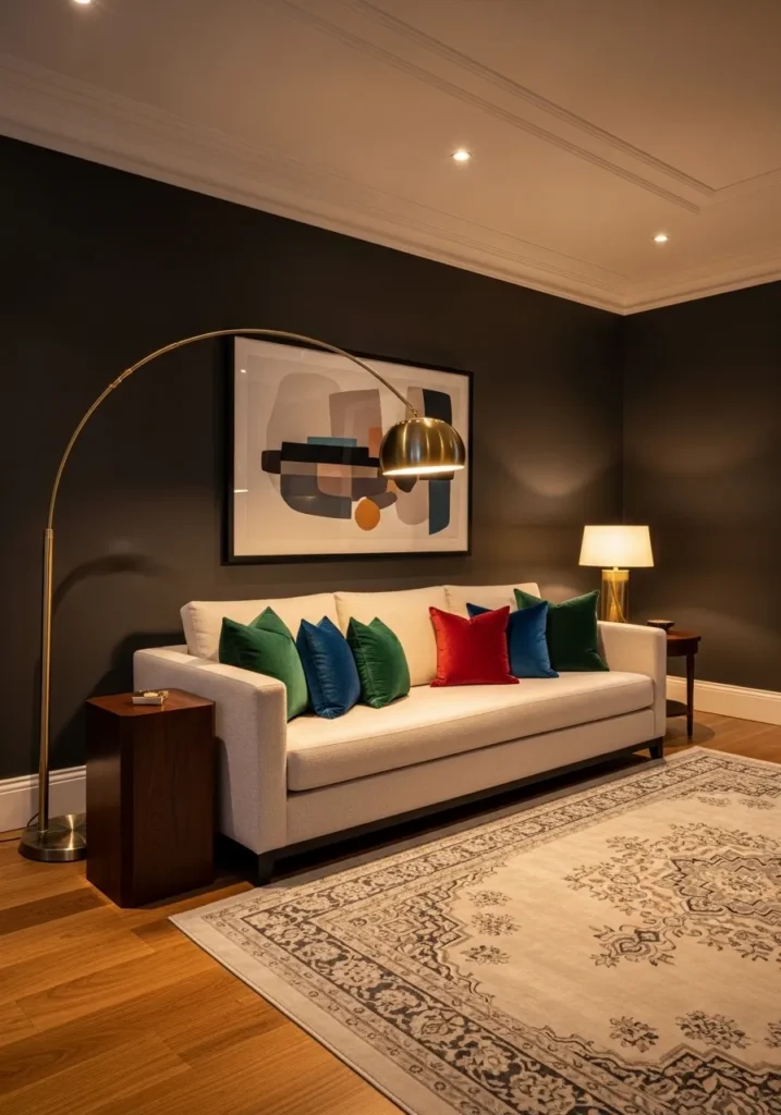
Balance the richness with creamy whites like Swiss Coffee and warm brass finishes. Incorporating plush textures like velvet or boucle ensures the space feels luxurious rather than heavy.
3. Creamy White Comfort — Swiss Coffee Living Room
Swiss Coffee OC-45 is replacing stark white walls with a softer, more welcoming alternative. It reflects light beautifully while still adding warmth, making your living room feel bigger and more inviting at the same time.
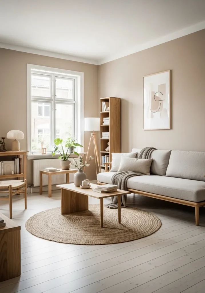
This palette thrives when layered with natural textures like jute rugs, wood tones, and soft neutral upholstery. It’s ideal for minimalist lovers who still want their space to feel cozy and lived-in.
💡 The right ceiling lighting makes every color palette come alive — follow this complete DIY guide to add soft LED cove lighting that perfectly enhances moody charcoals, deep greens, and creamy white living rooms:
➤ How to Add LED Strip Lights to a Pop Ceiling: Complete DIY Installation Guide4. Nature-Inspired Green — Soft Sage & Organic Layers
Soft greens like sage and eucalyptus are becoming essential in 2026 interiors. Sherwin-Williams highlights these tones as calming, nature-driven colors that connect indoor spaces with the outdoors. These hues create a peaceful environment without feeling boring or flat.
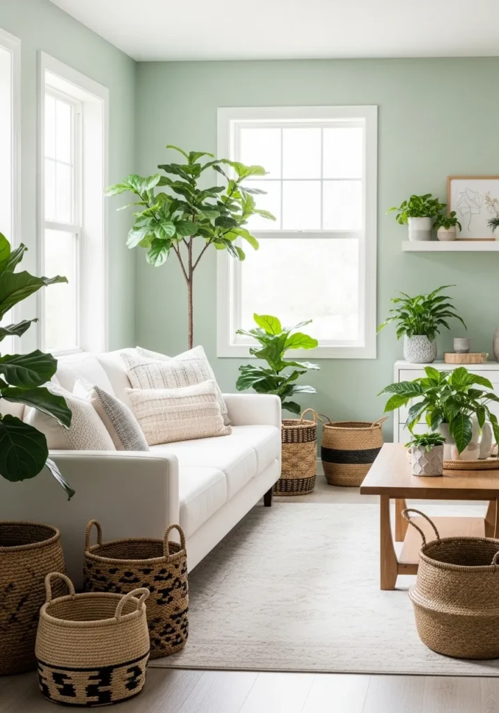
Pair sage green walls with cream textiles, woven decor, and indoor plants to enhance the organic feel. This palette works especially well in living rooms with natural light and neutral flooring.
5. Greige Revival — Warm Gray-Beige Blend
Greige is making a comeback, but with warmer undertones that feel more inviting than the cool grays of the past. This updated neutral bridges the gap between modern minimalism and cozy comfort, making it incredibly versatile for living rooms.
Layer this palette with darker wood furniture, soft throws, and matte black accents to add contrast. The result is a balanced, timeless look that works across multiple interior styles.
6. Deep Green Drama — Black Forest Green Living Room
Deep greens like Black Forest Green are redefining bold interiors in 2026. This shade creates a rich, enveloping feel that makes a living room look instantly elevated and intimate. It’s especially effective in spaces where you want to add depth and personality.
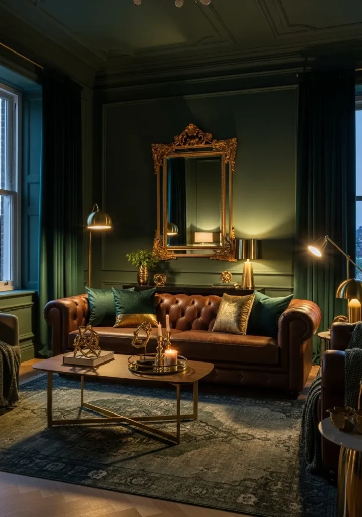
Pair it with gold accents, leather furniture, and warm lighting to enhance its luxurious vibe. When used correctly, this palette feels dramatic yet incredibly inviting.
7. Soft Blue-Gray Calm — Smoke & Muted Blues
Muted blue-grays like Smoke 2122-40 bring a subtle, calming energy to living rooms. These tones reflect light in a way that makes even small spaces feel more open and airy while still maintaining a cozy vibe.
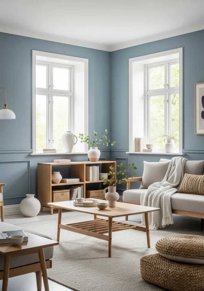
Combine this palette with white trim, soft textiles, and light wood furniture for a relaxed yet polished look. It’s perfect for anyone who wants color without overwhelming the space.
Final Thoughts
The biggest takeaway from 2026 living room color palettes is clear: warmth is replacing cool tones, and personality is replacing plain minimalism. Whether you choose the grounded elegance of Universal Khaki SW 6150 or the dramatic depth of Silhouette AF-655, the goal is to create a space that feels both stylish and comfortable.
These palettes aren’t just trends—they’re a shift toward homes that feel more human, layered, and lived-in.