
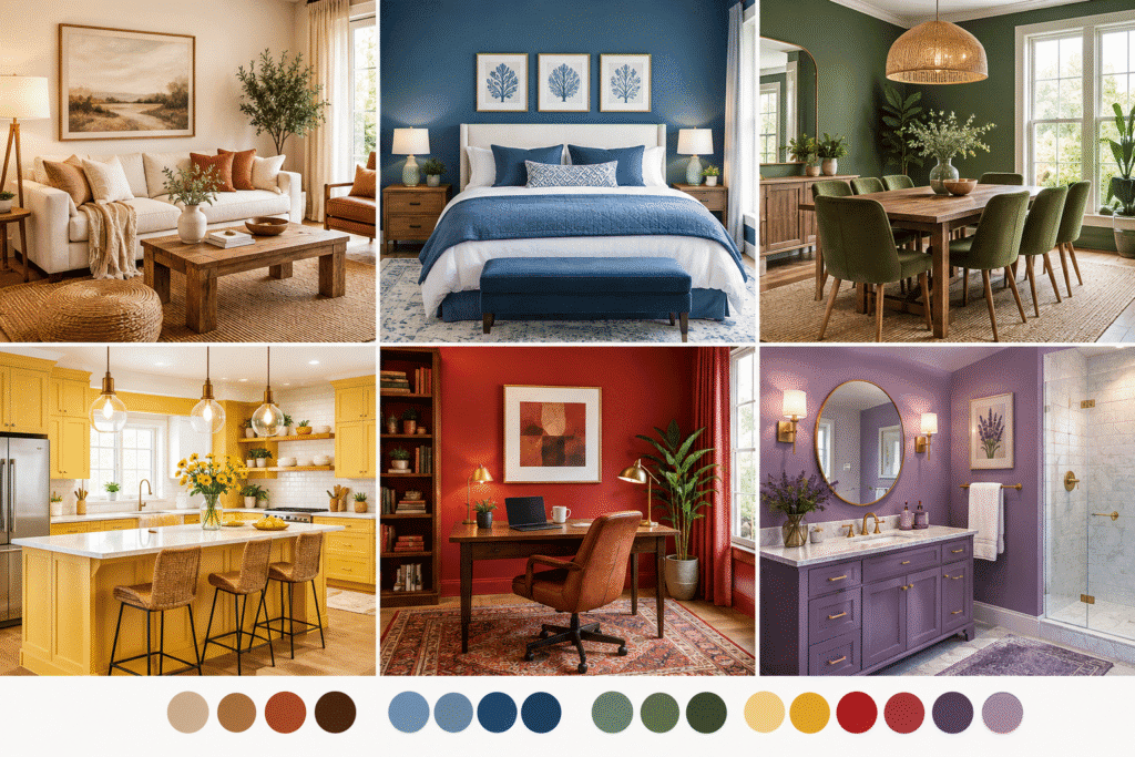
Color is not just decoration — it is information your brain processes before you even notice you are reacting to it. Walk into a soft blue bedroom and your shoulders drop. Walk into a bright yellow kitchen and you feel more alert. This is color psychology, and it is one of the most powerful (and least expensive) tools you have for shaping how a home actually feels to live in.
This idea sits underneath trends like dopamine decor and maximalist decor, both of which lean on color to boost mood and energy. But you do not need a fully maximalist room to use color psychology even one thoughtfully chosen wall color or accent can change how a space makes you feel.
Here is how color psychology actually works, and how to apply it room by room.
What Is Color Psychology?
Contents
- 1 What Is Color Psychology?
- 2 Mood-Boosting Colors and What They Do
- 3 Warm Colors vs. Cool Colors
- 4 Saturation and Shade Matter as Much as Hue
- 5 Color Psychology Room by Room
- 6 How to Choose a Mood-Boosting Palette for Your Whole Home
- 7 Color Psychology and Natural Light
- 8 Common Color Psychology Mistakes to Avoid
- 9 Quick Mood-Boosting Color Checklist
- 10 Frequently Asked Questions
- 11 Final Thoughts
Color psychology is the study of how colors influence human emotion, mood, and behavior. It draws from research in psychology, marketing, and design, and it is the reason hospitals often use soft greens, fast food restaurants use red and yellow, and spas lean on blues and neutrals.
In home decor, color psychology helps answer a simple question: what do you want each room to make you feel? Once you know the answer, you can choose colors that support that feeling instead of working against it.
Color affects mood through a few overlapping channels:
- Temperature — warm colors (red, orange, yellow) tend to feel energizing, while cool colors (blue, green, purple) tend to feel calming
- Saturation — bright, saturated colors feel more stimulating; muted, dusty versions of the same color feel softer and calmer
- Association — colors carry personal and cultural associations (green with nature, white with cleanliness, black with sophistication)
- Context — the same color can read differently depending on lighting, the colors around it, and the room’s purpose
Mood-Boosting Colors and What They Do
| Color | Common Emotional Effect | Best Used In |
|---|---|---|
| Yellow | Optimism, energy, alertness | Kitchens, entryways, home offices |
| Orange | Warmth, sociability, enthusiasm | Living rooms, dining rooms |
| Red | Excitement, appetite stimulation, intensity | Dining rooms, accent walls |
| Pink | Comfort, softness, playfulness | Bedrooms, nurseries, powder rooms |
| Blue | Calm, focus, relaxation | Bedrooms, bathrooms, home offices |
| Green | Balance, renewal, connection to nature | Living rooms, bedrooms, sunrooms |
| Purple/Lavender | Creativity, luxury, introspection | Bedrooms, creative studios |
| Coral | Energy with warmth, friendliness | Living rooms, kitchens |
| Gray | Neutrality, sophistication, calm (can feel flat if overused) | Living rooms, transitional spaces |
| Black | Drama, elegance, grounding | Accent walls, trim, small doses everywhere |
| White | Clarity, cleanliness, openness | Any room, especially small spaces |
No color is “good” or “bad” on its own — the effect depends on saturation, how much of it you use, and what it is paired with. A muted sage green feels calm and grounding, while a neon lime green in the same room can feel jarring and overstimulating.
Warm Colors vs. Cool Colors
Understanding temperature is the fastest way to predict how a color will feel in a room.
Warm Colors (Red, Orange, Yellow)
Warm colors advance visually, meaning they can make a large room feel cozier and more intimate. They tend to:
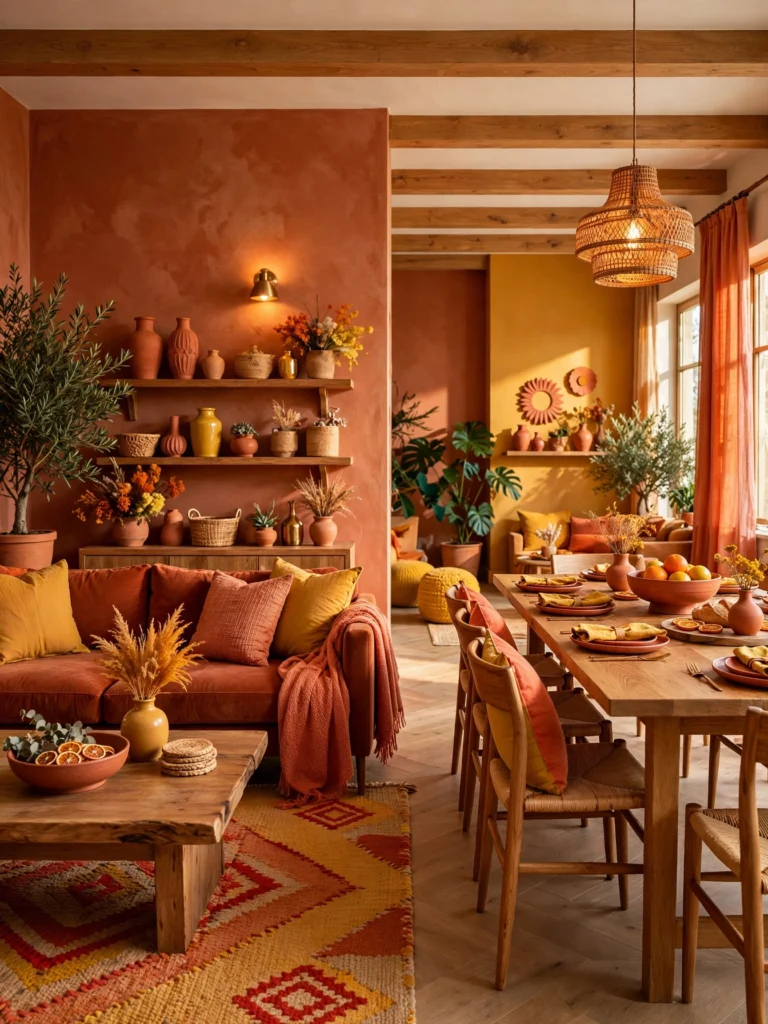
- Increase energy and appetite
- Encourage conversation and socializing
- Work well in rooms used for gathering, like living rooms and dining rooms
- Feel overwhelming in large doses in bedrooms or other rest-focused spaces
Cool Colors (Blue, Green, Purple)
Cool colors recede visually, making rooms feel more spacious and calm. They tend to:
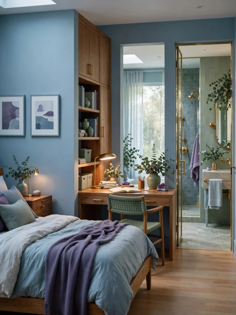
- Lower heart rate and support relaxation
- Support focus and concentration
- Work well in bedrooms, bathrooms, and home offices
- Feel cold or sterile if used without any warm accents
The best rooms usually borrow from both temperatures a cool wall color balanced with warm wood tones, brass accents, or a few warm-toned textiles.
Saturation and Shade Matter as Much as Hue
Two rooms painted “blue” can feel completely different depending on saturation:
- A bright cobalt blue feels energetic and bold, closer to a maximalist choice
- A dusty, muted blue-gray feels calm and restful, better suited to a bedroom
- A deep navy feels grounded and sophisticated, often used as a dramatic accent
When choosing a mood-boosting color, decide on the hue first, then adjust the saturation based on the room’s purpose. A home office might use the same yellow as a kitchen, but in a softer, more muted version so it energizes without becoming distracting.
Color Psychology Room by Room
Living Room
The living room usually needs to support both relaxation and conversation, so a balanced palette works best.
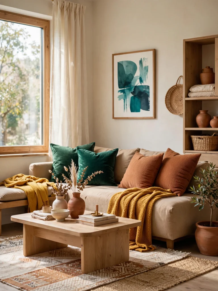
- Warm neutrals (terracotta, camel, cream) create a cozy, welcoming base
- Add a jewel-tone accent (emerald, teal, mustard) for energy without overwhelming the space
- Balance warm and cool tones with layered textiles and wood furniture
For a fuller palette-building approach, see our living room ideas guide and our tips on building a cozy living room.
Bedroom
Since the bedroom’s main job is rest, cool and muted colors tend to work best.
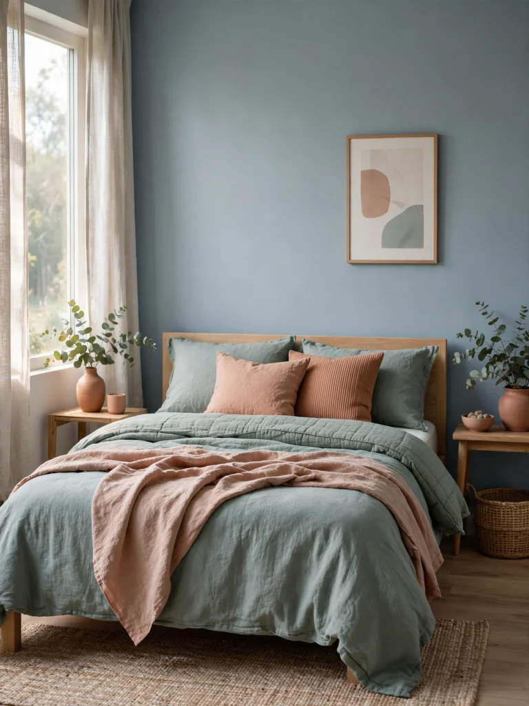
- Soft blues and blue-grays lower stimulation before sleep
- Muted sage or eucalyptus green feels grounding and natural
- Warm neutrals like soft terracotta or blush can add coziness without overstimulating
- Avoid highly saturated warm colors like bright red or orange on large surfaces, since they can feel too energizing for a rest space
See our full bedroom decor guide for layout and styling ideas that pair well with calming color choices.
Kitchen
Kitchens benefit from colors that feel energizing and appetite-friendly, since this is often the most socially active room in the home.
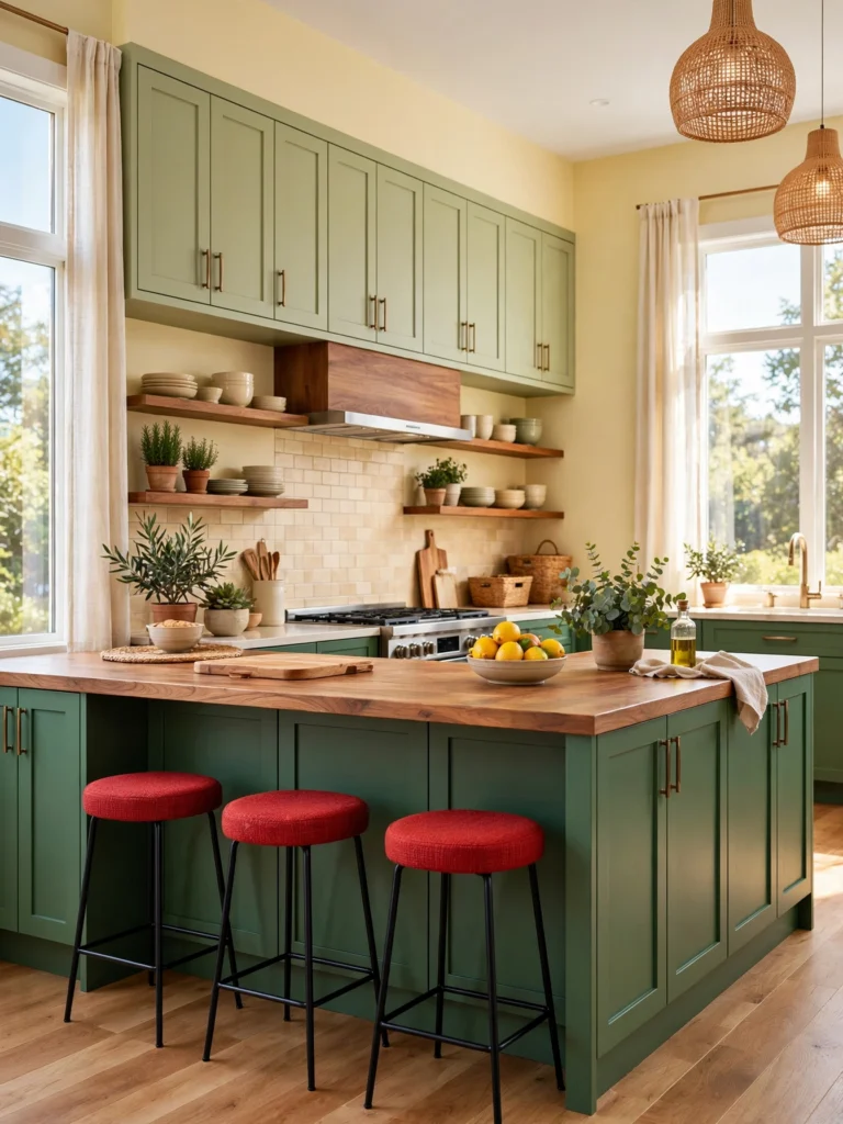
- Yellow and warm cream tones feel cheerful and bright
- Red accents (a backsplash, small appliances, or barstools) can stimulate appetite in small doses
- Sage or forest green cabinetry adds warmth without feeling overly saturated
- Balance bold cabinet colors with plenty of natural light and warm wood accents
Explore more direction in our kitchen ideas collection.
Bathroom
Bathrooms function best with colors that feel clean and calming, since this is a space for both quick routines and quiet relaxation.
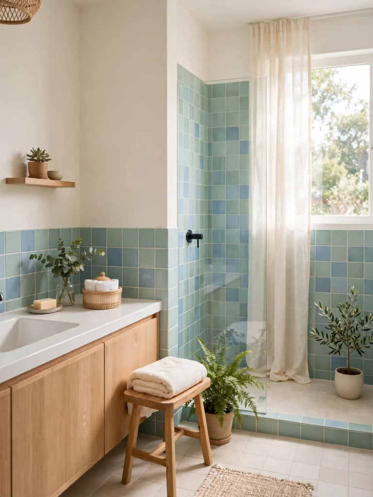
- Soft blues and seafoam greens support a spa-like feeling
- White and cream keep small bathrooms feeling open and bright
- Deep navy or forest green in a powder room can feel dramatic and luxurious in a space used briefly rather than daily
Home Office
A home office needs to balance focus with a small amount of stimulation, since too calm a space can feel sleepy and too bright a space can feel distracting.
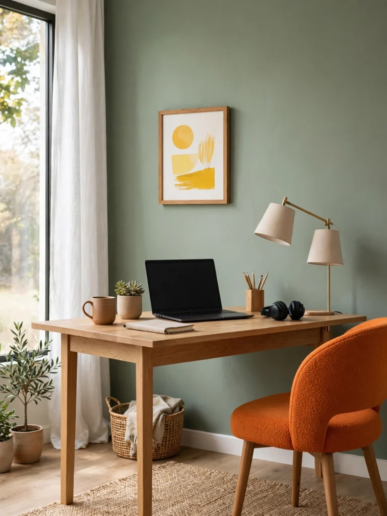
- Muted blue or green supports sustained focus
- A small dose of yellow or orange (in art, an accent chair, or accessories) keeps energy up without overwhelming the space
- Avoid oversaturating the whole room in one intense color, since this can become fatiguing during long work sessions
See our small office design guide for layout ideas that pair well with a focus-friendly palette.
Dining Room
Dining rooms can handle bolder, more saturated colors since they are used for shorter, more social periods of time.
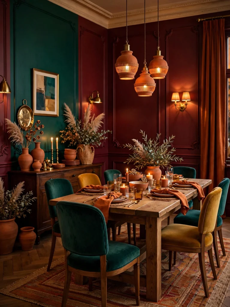
- Deep red or burgundy can stimulate appetite and conversation
- Warm orange or terracotta feels inviting for gatherings
- Jewel-tone walls paired with a large table and warm lighting create a dramatic, memorable space
How to Choose a Mood-Boosting Palette for Your Whole Home
Rather than picking a different unrelated color for every room, most successful mood-based color schemes follow a simple structure:
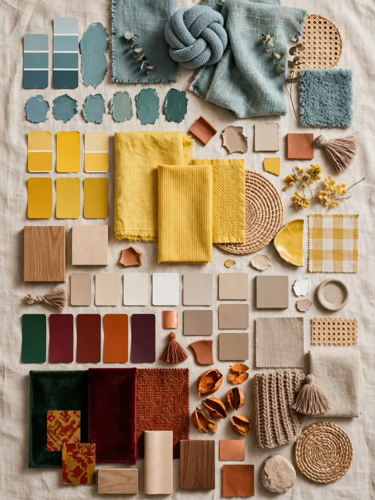
- Choose one anchor neutral that will repeat throughout the home (a warm white, greige, or soft taupe)
- Choose two or three “mood colors” based on each room’s purpose (calming blue-green for bedrooms, energizing yellow for the kitchen, warm jewel tones for the living room)
- Let color intensity shift by room, using more saturated versions in social spaces and softer, muted versions in rest spaces
- Repeat at least one accent color across adjoining rooms so the transition between spaces feels intentional rather than disjointed
For a deeper dive into building a full-home palette, see our guide to whole-home color palettes and our broader room color resource.
Color Psychology and Natural Light
The same color can look and feel completely different depending on the light in a room.
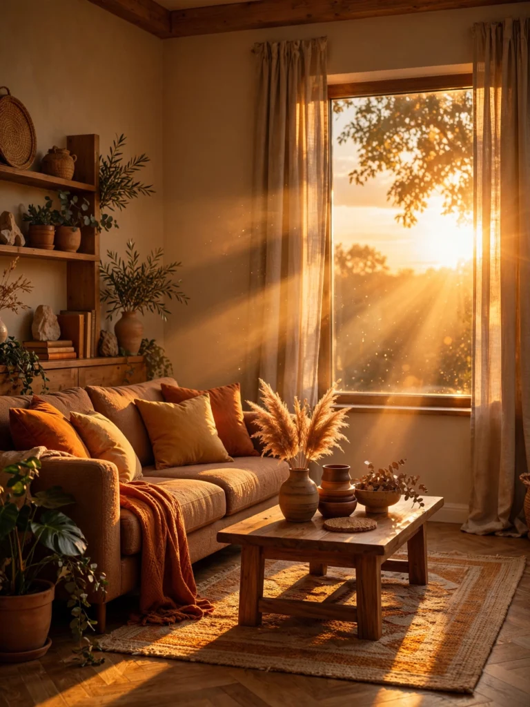
- North-facing rooms get cooler, bluer light, so warm colors (yellows, oranges, warm neutrals) help balance the coolness
- South-facing rooms get warm, direct light most of the day, so cooler colors can help prevent a room from feeling too hot or intense
- East-facing rooms get bright morning light and dimmer evening light, which can make colors shift noticeably throughout the day
- West-facing rooms get warm afternoon light, which can intensify already-warm colors
Always test a paint color at different times of day before committing to a full room, since artificial lighting and natural light will change how saturated a color appears.
Common Color Psychology Mistakes to Avoid
1. Choosing color based on trends instead of room function A trending color might not support what you actually need from a space. A trendy bright color in a bedroom can work against restful sleep, for example.
2. Using one saturation level everywhere A whole home in equally saturated colors can feel visually exhausting. Vary intensity by room based on its purpose.
3. Ignoring undertones Many “neutral” paint colors have hidden warm or cool undertones that clash with furniture or flooring. Always test swatches against your existing materials before painting.
4. Overlooking the ceiling and trim Color psychology applies to every surface, not just the main wall. A stark white ceiling in an otherwise warm, cozy room can feel jarring.
5. Skipping the accent layer Even a calming, neutral room benefits from one or two mood-boosting accent colors in textiles, art, or accessories to avoid feeling flat.
Quick Mood-Boosting Color Checklist
| Goal | Color Direction |
|---|---|
| Feel calmer | Soft blue, blue-gray, muted sage |
| Feel more energized | Yellow, orange, coral |
| Feel more focused | Muted blue or green with a small warm accent |
| Feel cozier | Warm neutrals, terracotta, camel |
| Feel more social | Warm jewel tones, red, orange |
| Feel more luxurious | Deep jewel tones paired with brass or gold |
Frequently Asked Questions
What is the most calming color for a bedroom?
Soft, muted blues and blue-greens are consistently associated with lower stimulation and better rest, especially in a matte or eggshell finish that softens the color further.
What color makes a room feel happier?
Warm, moderately saturated colors like yellow, coral, and warm orange are most commonly associated with feelings of happiness and energy, similar to the palette used in dopamine decor.
Should every room in my house be a different color?
Not necessarily. Repeating one anchor neutral throughout the home while varying accent colors by room creates a sense of flow without forcing every space to match.
Can color really affect my mood, or is that just marketing?
Color psychology is supported by research in both design and behavioral science, though individual responses can vary based on personal associations, culture, and lighting conditions.
What color should I avoid in a small room?
Very dark, highly saturated colors can make a small room feel more enclosed, though this is not a hard rule — some small powder rooms and reading nooks use dark, dramatic colors successfully because they lean into the coziness instead of fighting it.
Final Thoughts
Color is one of the most affordable, highest-impact tools available for shaping how your home feels day to day. Before choosing a paint swatch or a new sofa color, start with a simple question: what do I want this room to make me feel? From there, let temperature, saturation, and light guide the rest of the decisions. Whether you lean toward a fully maximalist decor approach or a single calming accent wall, understanding color psychology means every choice works with your mood instead of against it.
For more room-by-room color direction, explore our full interior design collection.