

Introduction
Creating a cohesive and visually appealing home begins with selecting the right whole-home color palette that ties every room together with flow, harmony, and personality. The best solution is to follow a structured approach: choose a dominant color like Quiet Moments 1563 or Steam AF‑15 that works well in most spaces and sets a calming tone; then layer in 2–3 secondary colors such as Paris Rain 1501, Love Story 1213, or Iced Marble 1578 to add subtle variety in bedrooms, bathrooms, or feature walls; select a consistent trim color like White Dove OC‑17 or Swiss Coffee OC‑45 for doors, moldings, and ceilings to unify the look; and finally, use bold accent shades like Shadow 2117‑30 or Tear Drop Blue 2053‑60 sparingly to create depth and visual interest.
This method ensures color flow and balance throughout your home, accounts for undertones and lighting conditions, and brings a designer-quality finish to your space—solving the challenge of disconnected or mismatched rooms with a simple, professional-level strategy.
Understanding Key Color Principles
To build a palette that truly works, it’s essential to understand a few foundational design rules. These color principles help guide the process, whether you’re a DIYer or a seasoned decorator.
One of the most helpful rules is the 60-30-10 Rule. This rule creates balance in any space by dividing colors based on usage:
This approach brings order and visual weight, ensuring that your space isn’t overpowered by any one color. Additionally, maintaining color flow from room to room is key. Rooms don’t need to be painted the same, but they should share similar tones or undertones to avoid disjointed transitions.
Lighting also plays a huge role. Natural light can warm up cool tones or soften bold hues, while artificial light might cast yellow or blue shadows. Before you commit to a color, test samples in each room at different times of the day to see how the light affects its appearance—especially in spaces like bathrooms, where Bathroom Tile Ideas in different color can look dramatically different under changing light.
Steps to Build a Whole‑Home Color Palette
Creating a successful palette isn’t about guessing. It’s about being intentional. Follow this step-by-step guide to get started:
- Pick Your Dominant Color
This is the anchor color—calm, flexible, and used in most rooms.
Try:- Quiet Moments 1563 – A soft, green-blue hue that brings serenity
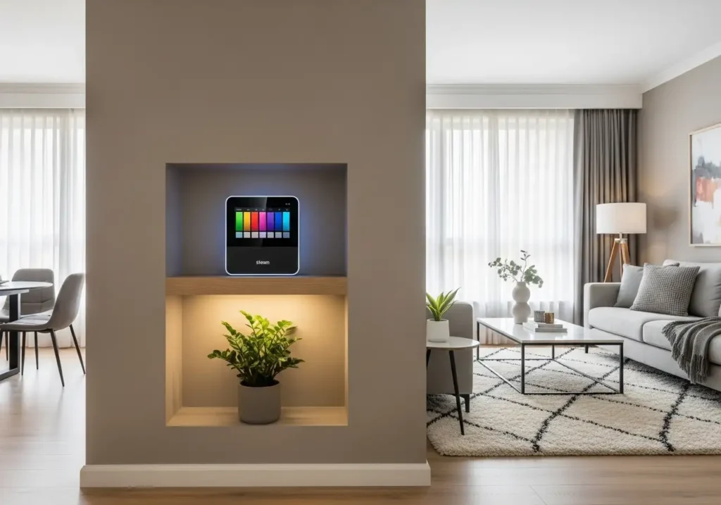
- Steam AF-15 – A warm, neutral greige that adapts to many styles
- Select 2–3 Secondary Colors
These colors add variety and character to different rooms.
Try:- Paris Rain 1501 – A subtle grey-green
- Iced Marble 1578 – A cool, stony blue
- Love Story 1213 – A warm, pale peachy pink
- Choose a Trim Color
Trim, doors, and ceilings benefit from a clean, off-white to tie everything together.
Recommended trims:- White Dove OC-17 – A timeless, soft white
- Swiss Coffee OC-45 – A creamy, warm white
- Chantilly Lace OC-65 – A bright, crisp white
- Add an Accent Color
Accent shades are where you express boldness—use them in moderation for contrast and depth.
Try:- Shadow 2117-30 – A rich, jewel-toned purple
- Tear Drop Blue 2053-60 – A cheerful, vibrant blue
- By combining these components, you’ll create a palette that not only looks stunning but also makes your home feel thoughtfully connected.
What Real Designers Recommend
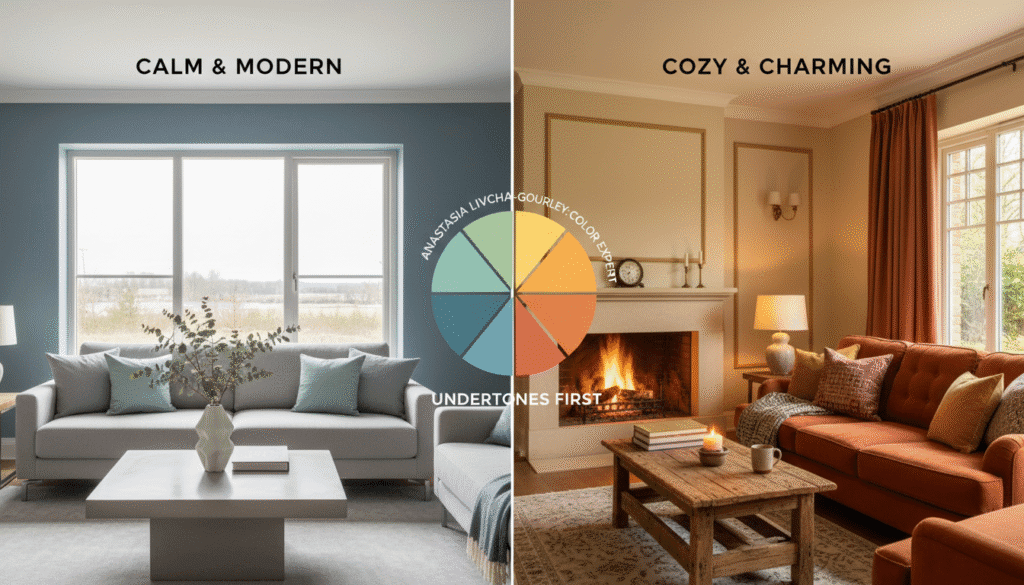
Color experts like Anastasia Livcha-Gourley recommend starting with a feeling—calm, cozy, bright—and choosing tones that evoke that mood. For instance, cooler undertones tend to feel clean and modern, while warmer tones offer comfort and charm. She encourages homeowners to focus on undertones first to avoid color clashing.
Designer Young Huh takes a layered approach. She builds palettes by mixing neutral bases with subtle secondary shades and adding expressive accents for personality. According to her, “cohesion doesn’t mean boring—it means balanced.” She also advises always using the same trim color throughout the home for unity.
🏡 3 Ready-to-Use Whole-Home Color Palettes
Now that you know the basics, here are three complete, real-world palettes to inspire your design. Each includes dominant, secondary, trim, and accent colors for a well-rounded scheme.
1. Farmhouse Fresh
Vibe: Warm, inviting, and rooted in comfort. Perfect for cozy family homes and natural textures.
- Dominant: Steam AF-15
- Secondary: Paris Rain 1501, Love Story 1213
- Trim: Swiss Coffee OC-45
- Accent: Shadow 2117-30
This palette pairs beautifully with wood flooring, shiplap, and soft textiles like linen or cotton. Think white oak furniture, cozy throw blankets, and farmhouse-style kitchens.
2. Coastal Breeze
Vibe: Light, airy, and inspired by sea and sky. Ideal for homes with lots of windows and natural light.
- Dominant: Quiet Moments 1563
- Secondary: Iced Marble 1578, Tear Drop Blue 2053-60
- Trim: White Heron OC-57
- Accent: Chantilly Lace OC-65
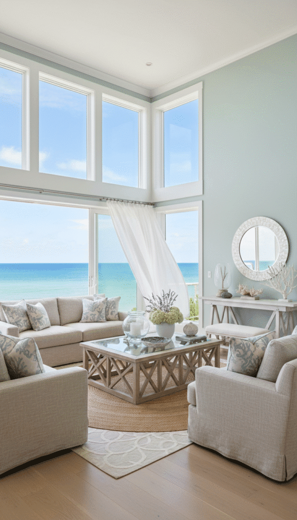
Use this in beachside homes, apartments with views, or anywhere you want a refreshing, vacation-like feel. Add whitewashed furniture and sheer curtains to complete the look.
3. Modern Traditional Elegance
Vibe: Sophisticated and timeless with a twist of charm. Works beautifully in older homes or classic interiors.
- Dominant: Steam AF-15
- Secondary: Love Story 1213, Paris Rain 1501
- Trim: White Dove OC-17
- Accent: Shadow 2117-30
🌟 Bonus Tips Before You Start Painting
Before you bring out the rollers, consider these expert-approved reminders:
- Sample First: Always test your colors in different rooms and lighting conditions.
- Repeat Your Trim Color: Keep consistency by using one trim color throughout.
- Think Long-Term: Choose colors that feel timeless to avoid frequent repainting.
- Use Visual Cues: Echo the accent or secondary colors in accessories, art, or textiles to tie rooms together.
Conclusion:
Designing your own whole-house color palette isn’t just about choosing beautiful colors—it’s about creating a space that feels uniquely yours. Whether you love the rustic charm of Farmhouse Fresh, the breezy vibe of Coastal Breeze, or the timeless look of Modern Traditional, these palettes offer a place to begin.
With the right mix of dominant, secondary, trim, and accent colors—and the help of Benjamin Moore® favorites—you can transform your home from top to bottom. Just remember to test, tweak, and trust your instinct. After all, the best color story is the one that reflects you.
Faqs
How many paint colors should I use in my home?
Stick to 1 dominant, 2–3 secondaries, and 1–2 accents. It’s all about balance.
What trim color goes with most palettes?
White Dove OC-17 and Swiss Coffee OC-45 are flexible and flattering for most wall colors.
Should all rooms be the same color?
No, but they should be related. Use variations of undertones to keep the flow.